
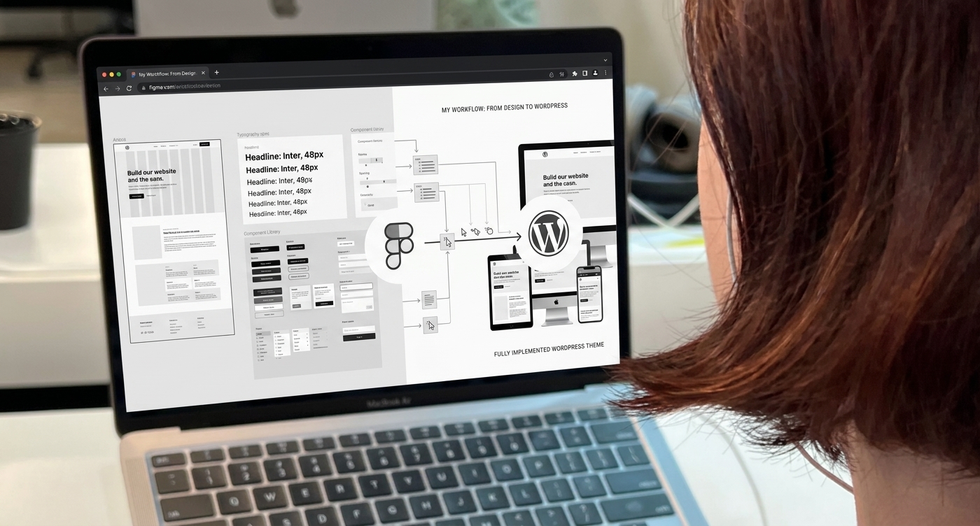
Turning Figma concepts into responsive WordPress websites
A Figma design is only the beginning. The real value comes from transforming that design into a responsive, functional, and user-friendly website.
As a UI/UX Designer and WordPress Developer, I work across both sides of the process—from designing the interface to bringing it to life.
Design Foundation
I start by defining the core visual system in Figma, including:
Typography · Color · Spacing · Grid · Components · Responsive Layouts
A clear design foundation makes development faster and more consistent.
Responsive Experience
A great website needs to work across every screen.
I plan how layouts, navigation, typography, images, and components adapt across:
Desktop → Tablet → Mobile
WordPress Development
Once the design is ready, I translate it into WordPress while maintaining the original visual direction.
I focus on reusable sections, responsive layouts, content flexibility, and smooth interactions.
Testing & Refinement
After implementation, I compare the website with the original Figma design and review:
Spacing · Typography · Alignment · Responsiveness · Interactions
Small refinements help bring the final website closer to the intended experience.
Design Meets Development
Working across both disciplines allows me to design with implementation in mind and develop with user experience in mind.
The result is a website that is visually refined, practical, responsive, and built for real users.
I turn design concepts into digital experiences people can actually use.
— Proshen Ranjan Kar
UI/UX Designer · WordPress Developer · Visual Designer